10 Tips for an Awesome Online Presentation
- Beth Singer, Principal
- Jul 2, 2020
- 3 min read
Updated: Dec 1, 2021
Calling all presenters, trainers, and fundraisers!
July 2, 2020 | Beth Singer, Principal
With the crazy number of online meetings we all have these days, you are probably assembling a toolbox with new ways to communicate. Enter an old friend: the slide deck. These have been around for ages, but you may not have used them as if your organization’s mission depended on them. Now, more than ever before, we need to secure the attention and devotion of our colleagues, most important donors, and supporters. And we need tools that are effective and easy to produce so we can keep our connections fluid, generate enthusiasm for our ideas, and open new doors.
Crafting a kick-ass online presentation can help ensure that your most important contacts are still in your court. If produced with clarity and passion, your presentation will show respect for those in attendance, thought leadership, and pride in your message and your organization. A combination of lucidity, persuasiveness, and great design will create a compelling experience for participants.
Here are 10 pointers for making your next presentation your best presentation!
1. Timing
Organize your content so that you change slides every 7 to 15 seconds. Your presentation should be visually stimulating and provide succinct content. The longer you keep a slide on screen, the greater the chance of losing your audience’s attention — no matter how good a speaker you might be.

2. Looks
The most appealing presentations don’t just have good grammar and nice pictures; they are beautifully designed. Just as with a well-written essay, a thoughtful structure and a polished style will help your ideas shine through. When you employ design excellence, you show your audience that you have carefully considered what you want to say and how to say it.
3. First slide
Your opening slide will set the tone and, just as with people, that first impression is critical. The first slide may be on screen for several minutes before your presentation begins, so make sure that it conveys a sense of excitement, is true to your brand or mission, and carries one of your important messages.
4. Last slide
Your last slide is equally important because it usually stays up after your talk is over. Use the last slide to encourage questions, cement a final message, give people contact information for email and social media, or as a final call to action.

5. Divider slides
Section openings have three important functions: 1) signaling your audience to pay extra attention because a new type of information is coming; 2) summarizing what you want them to remember about that section; and 3) offering a little break.

6. Brevity rules
Be succinct: The less you have on a slide, the more your audience will remember. A good rule of thumb is to limit your content to two sentences per slide or four short bullets.
7. Visual variety
Use a variety of photos or illustrations — and use them frequently. Select photos that tell a story related to your content and avoid using them purely for decoration. Studies show that the human brain retains information more accurately and longer when a visual element reinforces a verbal presentation. You can also “build” your message so that each bullet point comes up in succession on one slide by making an animated gif. These are quite easy to do and will add variety and rhythm to your presentation.

8. Rhythm
Pacing is important for engagement. Use a variety of approaches — some slides with text only, some with a balance of images and words, some with a dominant image, and use divider slides, where appropriate, to break up the presentation. Do not show the same kind of slide more than three times in a row, or you risk boring your viewers.
9. Data is very powerful
DO include bar charts, pie charts, and diagrams if they support your points. DON’T make them too complicated — they must be understood in a matter of seconds. Use your headline to explain what the data reveals and what you want your viewers to know.
10. Legibility
Pay close attention to legibility. White or light-colored type on a dark background is the easiest to read because of the contrast. (That’s why most highway signs are dark green with white letters.) A white or light background with dark type can also work well. Be sure to test for legibility on screens of different sizes — laptops, desktops, and tablets — to make sure your content can easily and quickly be read in all situations.

Have questions or need help with designing, editing, or writing your next presentation? Call or email us!
Or see our digital presentation package offers, and let us take care of the whole project for you.
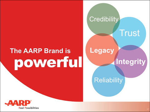
We specialize in creating digital slide decks with editorial clarity and design that enable you to connect with audiences and move them from interest to action. Check out these full decks we wrote and designed for AARP, Health in Harmony, and New Israel Fund.


Comments